
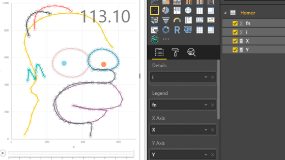
Recently I started exploring the limits of standard charts in Power BI and ended up drawing all sorts of mathematical … More
Experiments in Power Query & DAX
Recently I started exploring the limits of standard charts in Power BI and ended up drawing all sorts of mathematical … More
